Rebranding Sonic
The idea of rebranding has been running in the background for a few years.
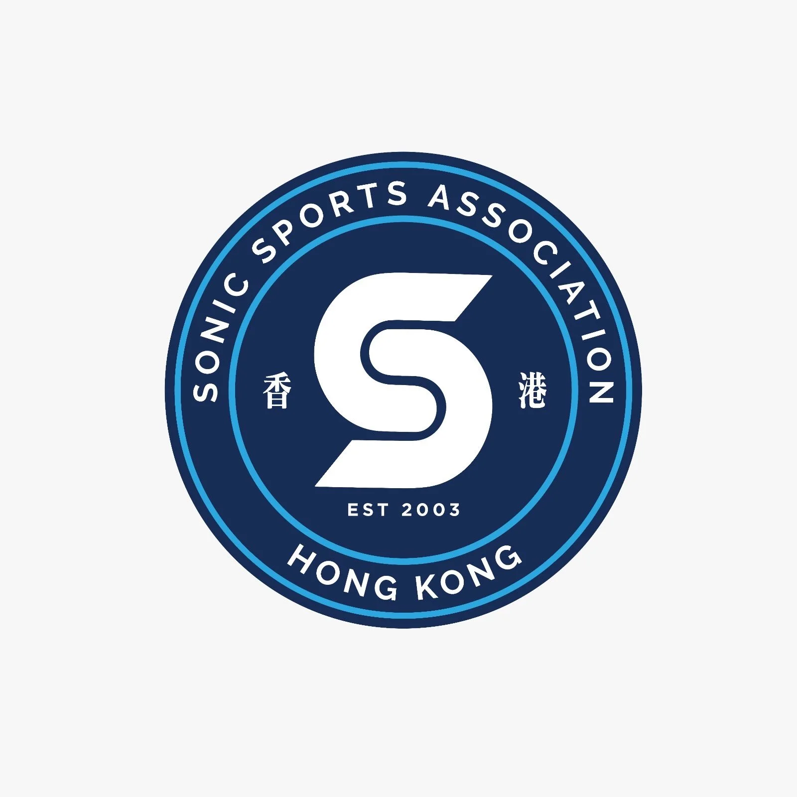
The meaning behind the new design of the logo represents the heritage of our past, and the legacy for our future of the sports club rooted in Hong Kong.
With a collective effort by Josie & Nick + Gigi & Charles, we are proud to unveil the new logo and colour in December 2024.
We are taking another important step in establishing our club, and today marks an important moment in the history of Team Sonic.
Our logo comprises the elements that represents Sonic.
Letter S for Sonic. The graphic, like a cycling chain, representing the bonding among our members and also the speed at which we strive to compete.
Sonic Sports Association is the official name of the club.
2003 is the year Sonic was established in Hong Kong. The chinese characters representing Sonic as a local triathlon club with an international perspective.
The main colour scheme is ocean blue, with white representing the purity of sport, finished with a splash of red to show our speed of pace.
The secondary logo #teamsonictriathlete, will be extended to our other branches such as #teamsonicjunior and #teamsonicalumni in the future.
We will follow with the full range of club kits refresh in year 2025!


